
First step — setting up the audit to cover most of the bases…
The initial data collection and user interviews were conducted as a group of five. Our aim was to quickly identify usability issues, using a mixed-methods approach that included heuristic, qualitative, quantitative, and accessibility assessments.
To streamline and define the project scope, we narrowed our target users to be first-time Celine shoppers, aged 25 and above, with average digital literacy.
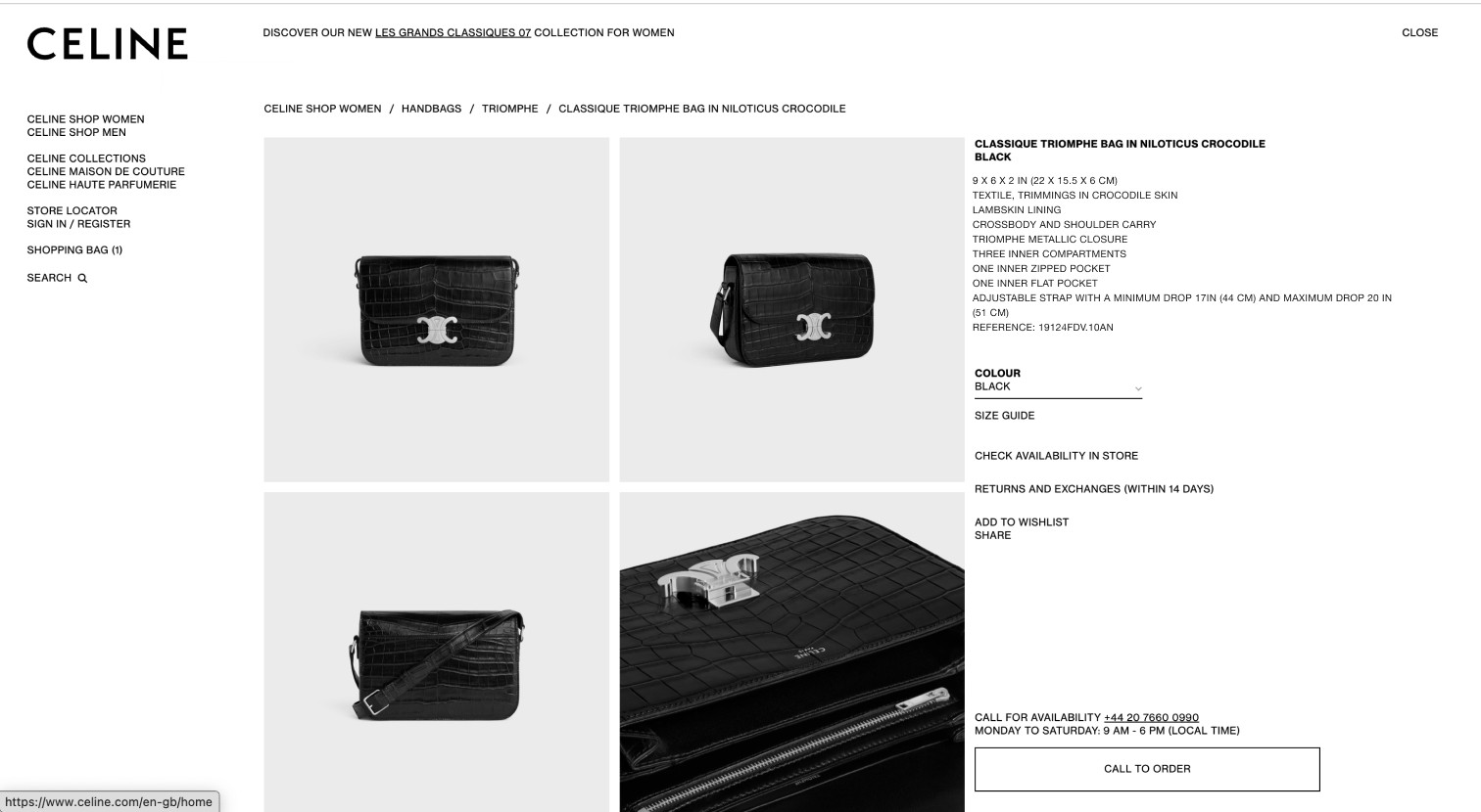
Given that Celine is an e-commerce site, we identified the key tasks users are likely to perform to be Delivery, Filtering, Search, Checking Product Descriptions, Sizing Information, Images, Returns, and Checkout.
Starting with a heuristics analysis of the website —
We conducted a series of short activities covering the major tasks to evaluate the website's performance against Jakob Nielsen’s 10 usability heuristics. This revealed 27 violations categorised which were then assigned a level of severity from 1 (cosmetic problem) to 4 (usability catastrophe). I presented the findings using bar graphs to clearly highlight patterns and problem areas to focus on.
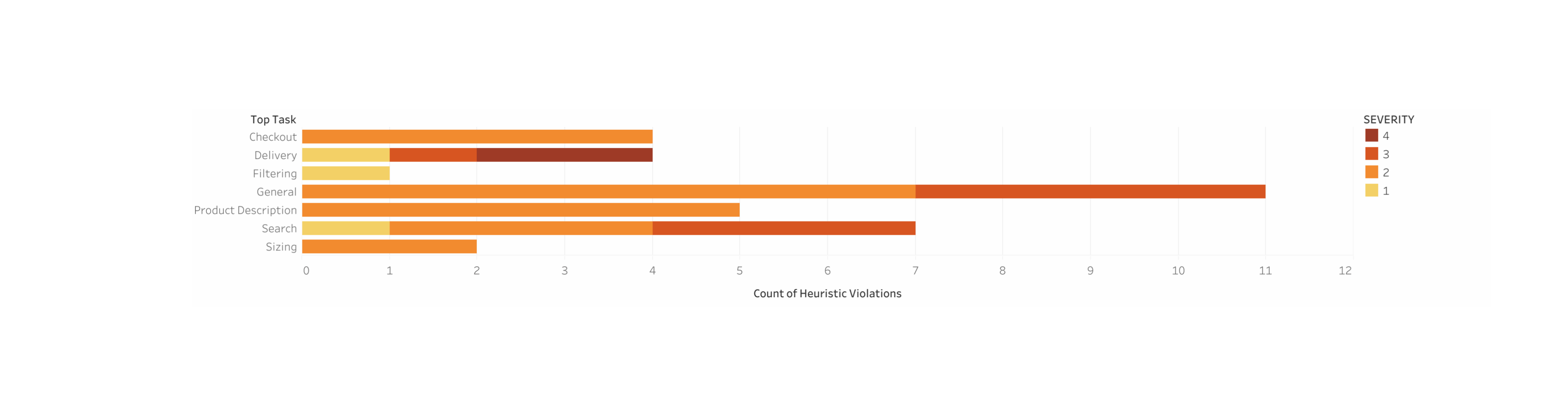
The graphs revealed —
The tasks of ‘Delivery’ and ‘Search’ are affected by the more severe usability issues (3 and 4).
This formed the basis of the next phase of the investigation - a quantitative evaluation.
Thus the quantitative evaluation was designed as a snapshot in time and focussing on searching and selecting a product after checking relevant product descriptions and other details (e.g., delivery, sizing).
Each of the team member recruited a participant within the target user group and conducted a testing. The participant was asked to complete a series of tasks, and their performance was recorded using metrics such as task completion time, efficiency, and self-reported feedback measured through a SUS (System Usability Scale) survey.
We noticed that the users were struggling with the site navigation, so we wanted to delve deeper into this issue —
The focus of the qualitative testing was thus narrowed down to investigating the navigation and information architecture of the website.
Again, the team recruited another set of participants who were given a ‘scavenger hunt’ task of locating a particular item from the Celine Maison Collection to assess how effectively users could navigate the site’s layout.
During the task, the think-aloud method was employed to capture participants’ thought processes. The collected data was then organised into categories of Saying/Doing/Thinking/Feeling, and compiled on Miro.

As the final step, an Accessibility Evaluation was conducted in accordance with the Web Content Accessibility Guidelines (WCAG) 2.2 —
The evaluation focused specifically on the task flow of booking an in-store appointment. It involved a manual review at first of the website's adherence to the Perceivable, Operable, and Understandable principles at levels A and AA, which was then validated by the WAVE Accessibility Evaluation Tool. The violations that were identified were as follows:

Finally, an affinity diagramming exercise was conducted to synthesise the findings from all the tests and identify key areas to address in the redesign —
👀 The users have difficulty navigating different webpages and spend a lot of time going back and forth looking for the correct page.

Before Image of the Celine Homepage
Navigation Design: Introduced a horizontal navigation bar that dynamically expands on hover for improved usability. The dropdown menu was designed to display relevant subcategories alongside the expanded main categories, providing better hierarchical clarity.
Visual Category Representation: I added visual icons to French category labels, making them more intuitive and user-friendly.
Call-to-Action Placement: Strategically repositioned key elements—sign-in/account section, search bar, and shopping bag—to the top-right corner, aligning with users' mental models and standard e-commerce design patterns for enhanced accessibility.
After Redesign of the Celine Homepage + Navigation
🤔 The users are confused about product details, including sizing and delivery timelines and policies.
Before Image of the Product Detail Page
Content Organisation: I reorganized information using Gestalt's principle to group related elements, such as delivery timelines and return/exchange policies, improving visual hierarchy and logical flow.
Call-to-Action Buttons: Added two clear CTAs, Add to Bag and Find In-Store, prominently positioned near product details to guide users toward primary pathways.
Collapsible Product Details: I designed in-depth product information to be collapsed by default and expandable on click, reducing visual clutter while maintaining accessibility.
Interactive Delivery Timeline: Implemented the delivery timeline as an interactive form field to emphasize its functionality as an actionable user element.
After Image of the Product Detail Page
🔎 The users spend longer time and multiple tries to find an item via search.

Before Image of the Search Functionality
Search Suggestions with Images: I added images alongside search suggestions that appear as users type, enhancing clarity and guiding them toward the correct items, reducing task errors.
Search History Feature: I introduced a previous search history feature, allowing users to quickly revisit and access their past searches for improved efficiency.

Redesigned Search Functionality
Learnings & Takeaways —
This project taught me key usability principles, including ease of navigation, efficient processes, consistent design, error prevention, and visually appealing aesthetics.
I learned to view a website as a collection of interconnected elements, where their alignment is essential for a seamless user experience. Striking the right balance between design and functionality ensures the site is both visually engaging and intuitive to navigate.
I realised that a well-designed, user-friendly experience leads to higher engagement, with users more likely to return and interact with the site.